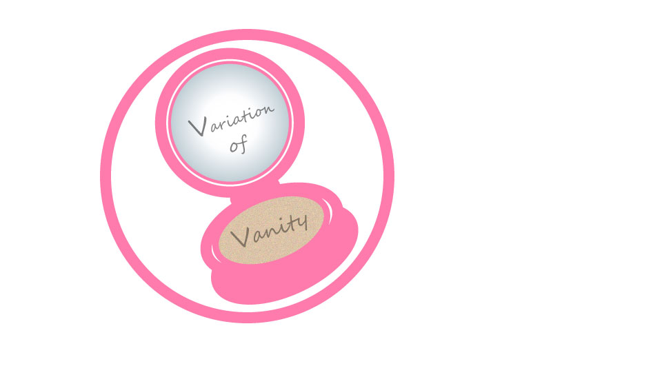
This is my rough draft for my logo 🙂

For my logo, I wanted to create something simple but relevant to my topic. I ended up going with a makeup compact. As my topic relates to self-care and beauty, I wanted to evoke that in my logo. I tried a few other ideas such as lotion bottles, face masks, bathtubs, etc. However, the makeup compact was my favorite idea. I was inspired by the makeup compact because it’s a product that people carry with them to touch up their makeup, it also has a mirror. I think it suits the theme of vanity well, and my blog aims to change the way we think of vanity so there is no shame in carrying a compact to touch up and make sure you still look fresh.
Initially I started with sketches, but my sketches looked more like a toilet bowl instead of a makeup compact, but I was hopeful I could make it look better in Adobe Illustrator. I started with using the ellipse tool and using fill and stroke tools to create images with multiple shapes. I used negative space to create the appearance of shine. I also used the gradient tool in order to give the mirror some character, and the grain tool to give the makeup sponge some texture. It was challenging to create the right shape for the compact, it went through many stages of looking like a toilet bowl or the number 8 before I got the right shape. Also working with so many shapes is difficult as sometimes I distort the shape on accident. As far as references are concerned, I used my memory of what makeup compacts, and cushions look like in order to make the same and played with styles from there. This was the process behind my logo draft, I hope to improve it.